First, I want to summarize several concepts about infographic from 2 videos in Creating Multimedia Learning Objects and Artifacts: Infographics & Augmented Reality.
- Why do people create infographics?
1) A picture is worth 1000 words. Infographic has generality. Effective infographic can convey the same meaning as the article or paper.
2) Infographic can make heavy topics easier to read. Pictures are easier to understand than large sections of text.
3) Visuals help readers process facts and figures more efficiently. Pictures and data are more straightforward and easier to understand in infographics. - What are the five principles of Multimedia Learning Theory: Infographics?
1) Multimedia principle
2) Signalling principle
3) Spatial and temporal contiguity principle
4) Coherence principle
5) Self-explanation principle - How do people create effective infographics?
1) informational honesty
2) legibility
3) simple illustrations
4) limited colors
5) interactive elements
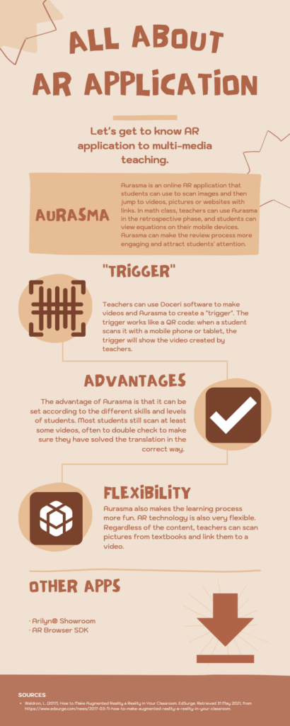
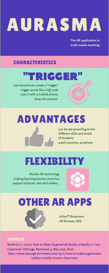
After rewatching videos, I have some dissatisfaction with the previous infographic I made. First, I think my title does not match my content. What I described in the content is about the characteristics of the APP AURASMA, but I wrote the title as ALL ABOUT AR APPLICATION, so I changed the title. Second, I did not in line with the Signalling principle. Text content is long. There is no summary or highlight. In subsequent changes, I summarized content to make it easy for readers to understand. I think I follow the principles of Spatial and temporal contiguity principle, Coherence principle, Self-explanation principle. The image elements match and are close to my text, and the text will also cause readers to think. I still think that what I need to change is that I did not follow the Multimedia principle well. My infographic only has text and image elements, and there is no data graph. I will pay more attention in the future. I followed the following suggestions in informational honesty, legibility, simple illustrations, limited colors, and interactive elements. I think I have created an effective infographic.